Expert
- CSS: W3C Specification and Browsers compatibility
- CSS: Selectors performance
- CSS: For different media (printing, mobile etc.)
- CSS Measures: Values, units, vh, vw, mm, inch, etc.
- CSS3: Multi-column Layout, Variables
- Preprocessors: advanced using (functions: math, color, misc)
- Bootstrap/Foundation: custom build
- Bootstrap/Foundation: alterniatives
- CSS methodologies: diffs, proc and cons
- Grids
CSS: W3C Specification and Browsers compatibility
Link: W3C
Can I Use: CanIUse
Statuses: Recommended, Working Draft, Candidate Recommendation, Editor’s Draft
- CSS Color Module Level 3
- Selectors Level 3
- Media Queries
- CSS Backgrounds and Borders Module Level 3
--
CSS: Selectors performance
The selectors can be split into a few groups and (roughly) sorted from the least to most expensive:
| rank | type | example |
|---|---|---|
| 1 | ID | #classID |
| 2 | Class | .class |
| 3 | Tag | div |
| 4 | General and adjacent sibling | div ~ a, div + a |
| 5 | Child and descendant | div > a, div a |
| 6 | Universal | * |
| 7 | Attribute | [type="text"] |
| 8 | Pseudo-classes and elements | a:first-of-type, a:hover |
TIP
Browsers read CSS from right to left. The rightmost selector in a compound selector is known as the key selector. So, for instance, in #id .class > ul a, the key selector is a. The browser first matches all key selectors. In this case, it finds all elements on the page that match the a selector. It then finds all ul elements on the page and filters the as down to just those elements that are descendants of uls — and so on until it reaches the leftmost selector.
Therefore, the shorter the selector, the better. If possible, make sure that the key selector is a class or an ID to keep it fast and specific.
Reduce the complexity of your selectors. Instead of writing
#nav > .list > li > a, use a single selector, like.nav-link. That way, you reduce the scope of style invalidation, since if you modify anything inside the #nav, you won’t trigger recalculations for the entire node.
CSS: For different media (printing, mobile etc.)
CSS:
@media not|only mediatype and (media feature and|or|not mediafeature) {
  CSS-Code;
}
HTML:
<link rel="stylesheet" media="screen and (min-width: 900px)" href="widescreen.css">
<link rel="stylesheet" media="screen and (max-width: 600px)" href="smallscreen.css">
| Value | Description |
|---|---|
| all | for all media type devices |
| for printers | |
| screen | for computer screens, tablets, smart-phones etc |
| speech | for screenreaders that "reads" the page out loud |
@media screen {
  body {}
  h1 {}
}
feature
- aspect-ratio
- orientation
- resolution
- width
- height
@media screen and (max-width: 600px) {}
@media screen and (min-width: 400px) {}
@media only screen and (orientation: landscape) {}
Speech
speak: normal | digits | literal-punctuation | spell-out
.news {
   speak: literal-punctuation; /* Reads all punctuation out loud in iOS VoiceOver */
}
CSS Measures: Values, units, vh, vw, mm, inch, etc.
CSS has several different units for expressing a length.
Many CSS properties take "length" values, such as width, margin, padding, font-size, etc.
Length is a number followed by a length unit, such as 10px, 2em, etc.
For some CSS properties, negative lengths are allowed.
Absolute Lengths
The absolute length units are fixed and a length expressed in any of these will appear as exactly that size.
Absolute length units are not recommended for use on screen, because screen sizes vary so much. However, they can be used if the output medium is known, such as for print layout.
| Unit | Description |
|---|---|
| cm | centimeters |
| mm | millimeters |
| in | inches (1in = 96px = 2.54cm) |
| px | pixels (1px = 1/96th of 1in) |
| pt | points (1pt = 1/72 of 1in) |
| pc | picas (1pc = 12 pt) |
WARNING
Pixels (px) are relative to the viewing device. For low-dpi devices, 1px is one device pixel (dot) of the display. For printers and high resolution screens 1px implies multiple device pixels.
Relative Lengths
Relative length units specify a length relative to another length property. Relative length units scales better between different rendering mediums.
| Unit | Description |
|---|---|
| em | relative to the font-size of the element (2em means 2 times the size of the current font) |
| ex | relative to the x-height of the current font (rarely used) |
| ch | relative to width of the "0" (zero) |
| rem | relative to font-size of the root element |
| vw | relative to 1% of the width of the viewport |
| vh | relative to 1% of the height of the viewport |
| vmin | relative to 1% of viewport's* smaller dimension |
| vmax | relative to 1% of viewport's* larger dimension |
| % | relative to the parent element |
TIP
The em and rem units are practical in creating perfectly scalable layout!
TIP
Viewport = the browser window size. If the viewport is 50cm wide, 1vw = 0.5cm.
CSS3: Multi-column Layout, Variables
Multi-column Layout
column-count (колличество колонок)
column-gap (расстояние между колонками)
column-rule (shorthand,
1px solid lightblue;)column-rule-style (
solid, стиль черты между колонками)column-rule-width (ширина черты между колонками)
column-rule-color (цвет черты между колонками)
column-span (сколько столбцов должен иметь элемент)
column-width (оптимальная ширина колонки)
.newspaper {
  column-count: 3;
  column-gap: 40px;
  column-rule: 1px solid lightgrey;
}
CSS Variables
The ```var()``` Function
Variables in CSS should be declared within a CSS selector that defines its scope. For a global scope you can use either the :root or the body selector.
The variable name must begin with two dashes (--) and is case sensitive!
The syntax of the var() function is as follows: var(custom-name, value)
| Value | Description |
|---|---|
| custom-name | required. The custom property's name (must start with two dashes) |
| value | optional. The fallback value (used if the custom property is invalid) |
Example
:root {
  --main-bg-color: coral;
  --main-txt-color: blue;
  --main-padding: 15px;
}

#div1 {
  background-color: var(--main-bg-color);
  color: var(--main-txt-color);
  padding: var(--main-padding);
}

#div2 {
  background-color: var(--main-bg-color);
  color: var(--main-txt-color);
  padding: var(--main-padding);
}
Preprocessors: advanced using (functions: math, color, misc)
@mixin button-state($btn-state) {
    @if (length($list-map) > 2 or length($list-map) < 5) {
        background-color: map-get($list-map, $btn-state);
    }
}
color
color: #468499 + #204479;- hsl($hue, $saturation, $lightness) Creates a color from hue, saturation, and lightness values
- hsla($hue, $saturation, $lightness, $alpha) Creates a color from hue, saturation, lightness, and alpha values
- hue($color) Gets the hue component of a color
- saturation($color) Gets the saturation component of a color
- lightness($color) Gets the lightness component of a color
- adjust-hue($color, $degrees) Changes the hue of a color
- lighten($color, $amount) Makes a color lighter.
- darken($color, $amount) Makes a color darker.
- saturate($color, $amount) Makes a color more saturated
- desaturate($color, $amount) Makes a color less saturated
- grayscale($color) Converts a color to grayscale
- complement($color) Returns the complement of a color
- invert($color) Returns the inverse of a color
- rgba($color, $alpha) Changes the alpha component for a color
- opacify($color, $amount) / fade-in($color, $amount) Makes a color more opaque
math
- percentage($number)
- round($number)
- ceil($number)
- floor($number)
- abs($number)
- min($numbers…)
- max($numbers…)
- random()
- +, -, *, /, *, !=, ==, ===, !==, >, <,
- and, or, not
misc
- if($condition, $if-true, $if-false) Returns one of two values, depending on whether or not $condition is true
- unique-id() Returns a unique CSS identifier
- variable-exists(red) // checks for $red
- mixin-exists(red-text) // checks for @mixin red-text
- function-exists(redify)
- global-variable-exists(red)
- selector-append('.menu', 'li', 'a') // .menu li a
- selector-nest('.menu', '&:hover li') // .menu:hover li
- selector-extend(...)
- selector-parse(...)
- selector-replace(...)
- selector-unify(...)
Bootstrap/Foundation: custom build
Bootstrap 3 можно кастомизировать, перейдя на сайт https://getbootstrap.com/docs/3.4/customize/ и с помощью чекбоксов поотключать ненужные части (компоненты, плагины jQuery, настроить переменные LESS)? выгрузить кастомный билд и положить в проэкт
Bootstrap 4 написан с помощью SASS, страницы кастомизации у него нет, можно кастомизировать с помощью partials:
Bootstrap 4 ships with a _custom.scss file for easy overriding of default variables in /scss/_variables.scss. Copy and paste relevant lines from there into the _custom.scss file, modify the values, and recompile your Sass to change our default values.
_variables.scss file: $enable-shadows, $enable-grid-classes, $enable-print-styles, ...
Foundation тоже написан на SASS, предоставляет такие же возможности для кастомизации через переменные (тут _settings.scss) или через страницу с чекбоксами как у bootstrap3 - https://foundation.zurb.com/sites/download.html/#customizeFoundation
Bootstrap/Foundation: alterniatives
- Bulma
- Skeleton
- Materialize
- BassCSS
CSS methodologies: diffs, proc and cons
OOCSS (Object Oriented CSS)
Принцип OOCSS заключается в раздельном существовании объекта и его модификаций. Это нужно для того, чтобы мы могли поместить клон объекта в любое место на сайте без необходимости перебивать существующие стили. Клон объекта через новый класс расширяется дополнительными стилями (дизайном). Таким образом, в html документе к одному блоку присваивается сразу несколько классов. Нанизывание классов характерно для многих фреймворков, например Bootstrap.
На помощь приходит SASS, а именно директивы
@includeи@extend. С их помощью к любому блоку можно присоединять дополнительные стили минуя html.Separate structure and skin
This means to define repeating visual features (like background and border styles) as separate “skins” that you can mix-and-match with your various objects to achieve a large amount of visual variety without much code. See the module object and its skins.
Separating structure and skin can also mean using classes to name your objects and their components, rather than relying solely on the semantics of HTML. For example, the media object is named with class="media", and its components are named with class="img" (for the image/video component) and class="bd" (for the body/text component).
By referencing these classes in your stylesheets (say, rather than directly styling the
<img>element), your HTML can be flexible. For instance, if a new media element were to take off in the next few years (e.g.<svg>), it could be integrated into the HTML without having to touch the CSS.Separate container and content
Essentially, this means “rarely use location-dependent styles”. An object should look the same no matter where you put it. So instead of styling a specific
<h2>with .myObject h2 {...}, create and apply a class that describes the<h2>in question, like<h2 class="category">.This gives you the assurance that: (1) all unclassed
<h2>s will look the same; (2) all elements with the category class (called a mixin) will look the same; and 3) you won’t need to create an override style for the case when you actually do want .myObject h2 to look like the normal<h2>.
BEM
.block — стиль для родительского блока
.block__element — стиль для вложенного дочернего блока.
.blockmodifier — стиль состояния блока.
BEM (Block, Element, Modifier) is a component-based approach to web development. The idea behind it is to divide the user interface into independent blocks. This makes interface development easy and fast even with a complex UI, and it allows reuse of existing code without copying and pasting.
Block
A functionally independent page component that can be reused. In HTML, blocks are represented by the class attribute.
- The block name describes its purpose ("What is it?" — menu or button), not its state ("What does it look like?" — red or big).
Element
A composite part of a block that can't be used separately from it
- The element name describes its purpose ("What is this?" — item, text, etc.), not its state ("What type, or what does it look like?" — red, big, etc.)
- The structure of an element's full name is block-name__element-name. The element name is separated from the block name with a double underscore (__)
Modifier
An entity that defines the appearance, state, or behavior of a block or element
The modifier name describes its appearance ("What size?" or "Which theme?" and so on — size_s or theme_islands), its state ("How is it different from the others?" — disabled, focused, etc.) and its behavior ("How does it behave?" or "How does it respond to the user?" — such as directions_left-top).
The modifier name is separated from the block or element name by a single underscore (_).
CSS Modules
A CSS Module is a CSS file in which all class names and animation names are scoped locally by default. All URLs (url(...)) and @imports are in module request format (./xxx and ../xxx means relative, xxx and xxx/yyy means in modules folder, i. e. in node_modules).
CSS Modules compile to a low-level interchange format called ICSS or Interoperable CSS, but are written like normal CSS files
modular and reusable CSS!
- No more conflicts
- Explicit dependencies
- No global scope
SMACSS
SMACSS расшифровывается как «масштабируемая и модульная архитектура для CSS» (Scalable and Modular Architecture for CSS). Основная цель подхода — уменьшение количества кода и на упрощение поддержки кода
SMACSS существует пять типов категорий:
Base rules — базовые стили. Это стили основных элементов сайта — body, input, button, ul, ol и т.п. В этой секции используются в основном селекторы тэгов и атрибутов, классы — в исключительных случаях (например, если у вас стилизованные JavaScript’ом селекты);
Layout rules — стили макета. Здесь находятся стили глобальных элементов размеры шапки, футера, сайдбара и т.п. Джонатан предлагает использовать здесь id в селекторах, так как эти элементы не будут встречаться более 1 раза на странице. Однако автор статьи считает это плохой практикой (каждый раз, когда в стилях появляется id селектор, где-то в мире грустит котенок). Используйте классы и будет вам счастье.
Modules rules — стили модулей, то есть блоков, которые могут использоваться несколько раз на одной странице. Для классов модулей не рекомендуется использовать id и селекторы тэгов (для многократного использования и независимости от контекста соответственно).
State rules — стили состояния. В этом разделе прописываются различные состояния модулей и скелета сайта. Это единственный раздел, в котором допустимо использование ключевого слова «!important».
Theme rules — оформление. Здесь описываются стили оформлений, которые со временем, возможно, нужно будет заменить (так удобно делать, например, новогоднее оформление; для html-тем, выставленных на продажу такие стили позволяют переключать цветовую гамму и т.п.).
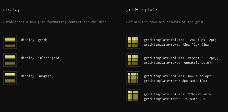
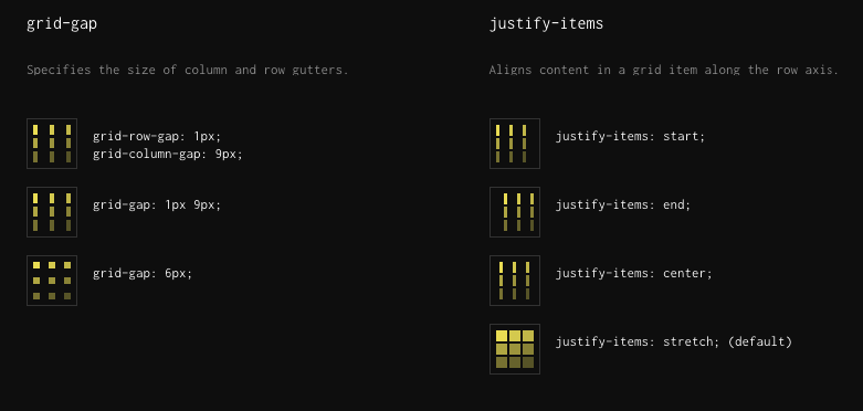
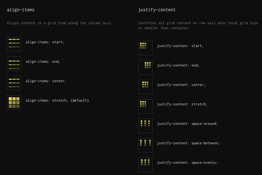
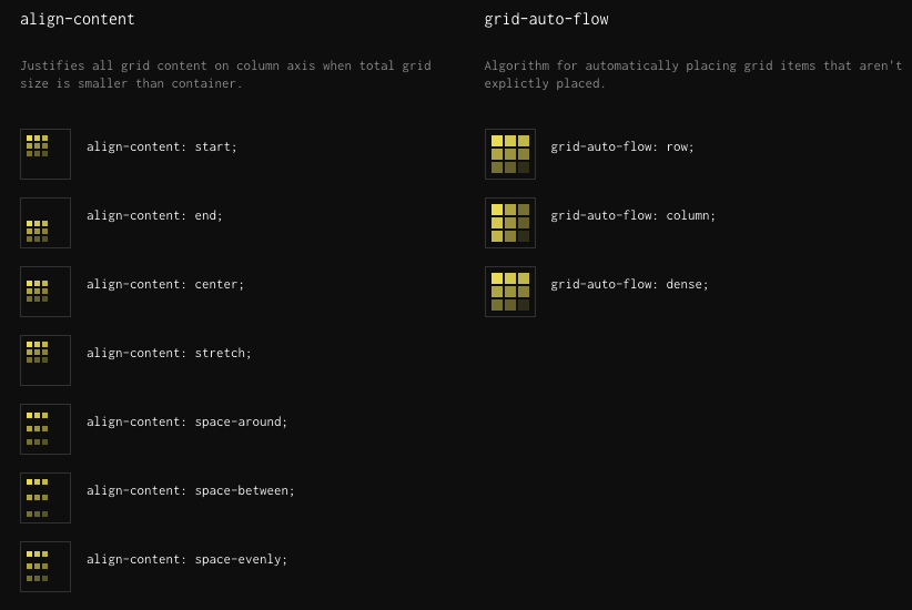
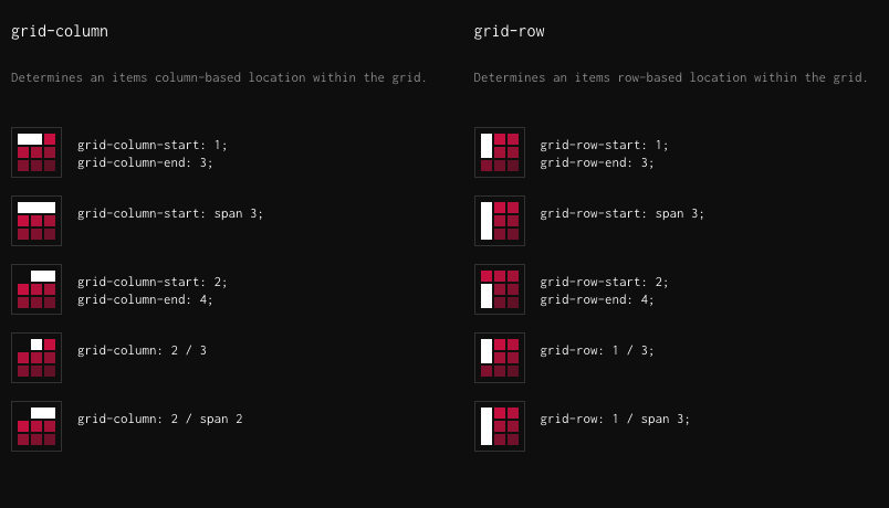
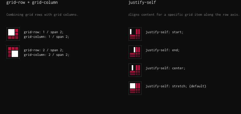
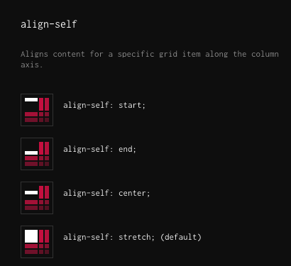
Grid